

Upside Down Traffic Signals


I guess it’s one of those things that I’ve just taken for granted. I mean, for a traffic signal enthusiast, we’ve always known that red is on the top and green is on the bottom. There are a couple of exceptions that have to do with some interesting history. But every other vertically-mounted signal in the United State is set up with the red on top.
With the increasing popularity of motor travel in the early 1900s, many firsts had emerged. The first center line appeared, the first stop sign popped up, the first official route signs were laid out, and the first traffic signal became part of the landscape.
By 1927, a committee called the American Society for Municipal Improvements recommended that red be on top and green be on the bottom of these traffic signals. In 1930, the National Conference on Street and Highway Safety (NCSHS) published the Manual on Street Traffic Signs, Signals, and Markings. This set similar standards for urban settings, but also added specific guidance on traffic signals, pavement markings, and safety zones, including the guideline for red on top and green on the bottom.
So basically, for the last 95 years, traffic signals are supposed to have red on top and green on the bottom.
Today, the groups that began creating those guidelines for safer vehicular travel around the country can be found in the Manual for Uniform Traffic Control Devices. Otherwise known as the MUTCD.
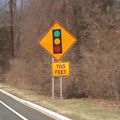
Upside-down Signal Ahead road sign
But why do I see so many misconfigured traffic signals? I’m not referring to the ones on the road. There is one exception, but I’ll get to that later. I’m referring to illustrations, toys, and models. Not uncommon is the occasional upside down Signal Ahead road sign. Yes. Real road signs placed by workers who should know better.
I’d like to take a poll some day and randomly go up to people asking them what color is on top. It wouldn’t surprise me to hear a few people tell me that green is on top. I’ll get back to you on that when I actually have results.
However, here are a couple of exceptions to the red-on-top rule.
The W.S. Darley C-811 was Half Upside Down
 In the late 1920s, W.S. Darley & Company began manufacturing signals that were purposefully configured with red on top for main street while the cross street had green on top. The design acted as a cost-saving measure for smaller towns that wanted to save money on their traffic control devices.
The signals worked by utilizing a single bulb illuminating lenses for each section in all four directions. For example, the top would have red lenses for the main street and green lenses for the cross street. That single bulb lit up all four direction. When the light on the bottom would illuminate and change to green for the main street, the cross street then had a red on the bottom for them.
These signals even had a built-in electro-mechanical controller in the base of the signal that ran the show. Pretty sweet design. Three bulbs, minimal wiring, simple design. But eventually these signals went the wayside.
Perhaps red on top was merely a “suggestion” and not set-in-stone?
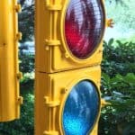
Tipperary Hill is Always Upside Down
 As I mentioned before, there is one exception in the United States where this is an exception.
The only red-on-top signal that still exists hangs at an intersection in the Tipperary Hill section of Syracuse, New York. As a predominantly Irish community, they perceived the colors of the traffic signal to represented red British superiority over Irish green inferiority. That didn’t go over well and a group of youths, known as “stone-throwers,” began hurling rocks as the signal. Since plastic lenses didn’t exist in the 1920s, the glass did not fare well.
After a couple of lens replacements, the damage continued. Eventually, the city relented and changed the signal so that the green was at the top. It’s been like that ever since.
So despite the limited history of inverted colors on traffic signals, and the fact that many of us see traffic signals every day, why do I see so many incorrectly represented signals? My guess is that people just don’t notice or care to notice what color is on top. They just know red means stop and green means go.
And yellow means go faster.
